908.627.3663 | download my resume


UYA Brochure
This was a brochure designed for the organization, Urban Youth Action. For the assignment, we worked closely with a representative from UYA and went through three separate iterations before arriving at a final draft. This was the first brochure I had designed in a while and I had a lot of fun playing around with the layout, paper size, folding and content. I wanted to avoid the typical trifold. There was a lot more to designing a brochure vs. designing a book or document. Dealing with the element of folding was interesting. Some information and parts of the document are only shown to the reader after they unfolded a part of the brochure. Because of this, I paid a lot of attention to each possible "spread" as a separate document.
<< prev
next >>
Software:
Date:
Client:
InDesign
Nov. 2010
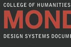
Chapter Design
The assignment was to redesign a manuscript chapter given to us in an unstyled word document. The only stipulations to the assignment was that we must use regular (8.5" x 11") sheets of paper and that it must be only one column. This made dealing with line-length and margins especially tricky. Meanwhile, we had to deal with a header hierarchy and keep in mind the serious, and clean look and feel generally associated with textbooks and manuscripts.
<< prev
next >>
Software:
Date:
Client:
InDesign
Sept. 2010
Document Design (class)
Helping Haiti
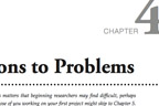
Shortly after Carnegie Mellon began its Spring 2010 semester, a devastating earthquake hit the nation of Haiti. To support Haiti in any way we could, Carnegie Mellon's Devision of Student Affairs, Student Government and various student organizations and greek life combined with a unified effort to support the people of Haiti. This logo was the official logo of the 'Carnegie Mellon Helping Haiti' campaign. It was printed as stickers, fliers and published online on CMU's website.
<< prev
next >>
Software:
Date:
Client:
Illustrator
Jan. 2010
Carnegie Mellon University
International Festival
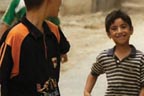
Each year, Carnegie Mellon holds an International Festival to celebrate the school's diversity and to educate the university on different cultures and current events. In 2009, the theme of the festival was 'what happens when diplomacy fails'. These posters were created for this event.
For the event, FORGE created a simulation of a refugee camp. The posters were hung in and around the 'booth'. Additionally, we brought in many props to help simulate the conditions and projected an educational video outside the tent. The last poster in this group were the instructions for how to play the game we created for our display.
<< prev
next >>
Software:
Date:
Client:
Illustrator
Oct. 2009
Gandhi Quotes
In honor of Gandhi's 140th birthday, Carnegie Mellon held a variety of different events (discussions, lectures, various activities) for the students. During the few days building towards these events, these posters were created and hung all around the University Center.
<< prev
next >>
Software:
Date:
Client:
Illustrator
Nov. 2009
Carnegie Mellon University
Event Fliers
Various fliers created for events and organizations around campus.
<< prev
next >>
Software:
Date:
Client:
Illustrator, Photoshop
2008 - Present
Various Organizations
Acupuncture
A business card done for a local acupuncturist in Lebanon, NJ.
<< prev
next >>
Software:
Date:
Client:
Illustrator
Jun. 2009
Acupuncture & Holistic Health Care
How To: PB&J
This assignment was for a class called, 'Communication Design Fundamentals'. The assignment was to create an instructional step-by-step booklet on how to make a peanut butter and jelly sandwich. I created all of these pictures of the bread and jars, etc on Adobe Illustrator from scratch. I imagined the booklet would be for children so I tried to make both the pictures and the directions as simple as I could get them.
<< prev
next >>
Software:
Date:
Client:
Illustrator, InDesign
Apr. 2008
Communication Design Fundamentals (class)
This American Life
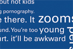
The assignment was to design a poster made of only text about the radio show 'This American Life'. I decided to approach the project by taking one episode and writing down every phrase, word and sentence that I thought was interesting or strongly emphasized. After jotting down these words, I placed them altogether building off each other. The episode was called 'How to Talk to Kids'. All of the white text were phrases and words that dealt with the episode and the surrounding faded text are words and phrases that I simply found interesting or shocking.
<< prev
next >>
Software:
Date:
Client:
Illustrator
May. 2008
Communication Design Fundamentals (class)
Gestalt Study
This was a study of the Gestalt Principles using simple shapes (circles and squares). We were to make five 6"x 6" boxes with an increasingly larger number of shapes in each. The teacher was rather unspecific with the directions and told us to make the shapes "aesthetically pleasing" (whatever that means). I felt a lot better about this project using circles than I did with the squares.
<< prev
next >>
Software:
Date:
Client:
Illustrator
Feb. 2008
Communication Design Fundamentals (class)
LOADING...