908.627.3663 | download my resume

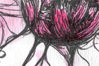
Work Hard, Play Harder
This was one of the assignments for a Drawing Studio I took during the Fall of 2010. The assignment was to depict one thing that you value and one thing that you do not. We had to use ink as our medium and one of the pieces must emphasize negative space whereas the other must have a strong use of contour lines. The two drawings collectively must be from a 24" x 36" piece of paper.
I divided the paper in this way because I've never worked on anything in this proportion and I thought it'd be fun. As far as what I value and what I don't, I purposely chose something ambiguous and based on your mood.
<< prev
next >>
Medium:
Size:
Date:
Ink
36" x 12"
Oct. 2009
Still Life
During the Spring of 2010, I took a small, still-life course. The class was a student-taught course so there was a lot of freedom in the assignments and very low key. These are just some of the drawings that came out of it.
<< prev
next >>
Medium:
Size:
Date:
Charcoal
8.5" x 11"
Spring 2010
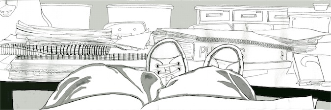
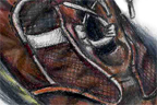
Shoes
A while back, I started getting into the habit of drawing my shoes before tossing them out. The cracks and tears looked really interesting to draw and I figure it'd be fun to keep a record this way.
Medium:
Size:
Date:
Colored pencil, graphite
8.5" x 11"
Dec. 2007
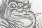
Chef's Revenge
Slightly inspired by the famous Escher Drawing as well as something I saw on DeviantArt. I thought it was a really neat concept to draw. It was nice mixing medias. Drew most of it in detention (thank you Mr. Duerring).
Medium:
Size:
Date:
Colored pencil, graphite
17.5" x 10"
Apr. 2007
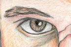
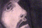
The Artist
Modeled by the amazing Gary Hammell. This drawing took just about forever to finish (curse colored pencils!) and although there are some awkward moments (note the hair), I'm pretty satisfied with the result. I titled it 'The Artist' because it's supposed to represent the imagination and thoughts that go on through an artist's head. It can also be interpreted that an artist's ideas and intents live on past his own death via his work
Note: I'm actually not much for symbolism and meanings, I kind of just made up these interpretations as I went along. But, shhh...
Medium:
Size:
Date:
Colored pencil
15" x 16"
Nov. 2006
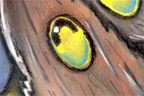
Unlock
First of a series of three I did during junior year (high school). Throughout the entire series, I used very bright colors to try to get across an optimistic theme. In this particular piece, I scattered a variety of different icons that represent hope and optimism.
Medium:
Size:
Date:
Colored pencil
12" x 15"
Dec. 2005
Go
Third part of a series I did during junior year (high school). Throughout the entire series, I used very bright colors to try to get across an optimistic theme. However, this one in particular, I concentrated more so on shapes and abstractions than any of the other two.
Medium:
Size:
Date:
Colored pencil
12" x 15"
Jan. 2006
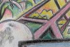
Sunrise, Sunset
My concentration for the AP Portfolio was surrealism and the abstraction of reality. This is one of the pieces I made to follow with that theme.
This was the first time I had ever used oil pastel. My only regret is that I wish I worked with a bigger piece of paper. It was really hard getting details into such a small area with oil pastel.
Medium:
Size:
Date:
Oil pastel
14" x 20"
Apr. 2007
We Are But Puppets
A bit surreal, I had been toying with the idea of a silhouette city for a while so I drew a bit of an abstracted one. The sun being a ball of string was a bit spontaneous but it really makes the title work out nicely. I loved the touch of watercolor at the end of this, especially the purple/yellow gradient on the bottom.
Medium:
Size:
Date:
Ink, watercolor
9" x 6"
Dec. 2006
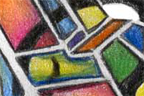
Convergence
Inspired by a piece I saw on deviantArt. One of the smaller pieces I did last minute to try to get enough ready for the AP test. There's not really any rhyme or reason for any of the things I threw onto the drawing.
Medium:
Size:
Date:
Colored pencil
9" x 6"
Dec. 2006
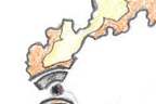
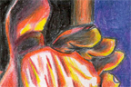
Fire
I drew this from a slightly edited photo I found on flickr. Thought it would be cool to draw it with really high contrast and warm colors. Halfway through, I realized that the wrinkles on the guy's feet looked like fire so I went with it.
Medium:
Size:
Date:
Colored pencil
9" x 6"
Dec. 2006
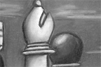
Your Move
That fantastically handsome man you see in this drawing was modeled off of Alex Mulhearn. The assignment was to draw someone 'in' something. So I decided to draw a person in a chess game. This drawing took a lot of thought and planning before I could even start actually drawing it. I had to pick an angle to draw from as well as plot out the entire board. This planning step alone took a lot of time and a lot of sketches.
Medium:
Size:
Date:
Charcoal
18" x 24"
Sept. 2006
Tears of the Moon
Out of the cloudy drifts
From the shadow sheet of night
On tides of musk a moth uplifts
Its wings weary from the flight
Above the leaves and beyond the sky
There is a being; brilliant, bright
None may deny its flawless shape
A perfect ball of light
A little brown flit
Seeking consummation
It makes its way
Led by lunar navigation
As the air thins and the winds blow
The moth approaches the unapproachable
In minutes the moth begins to slow
The cold is unbearable
As it falls through the sky, the moth hopes to be saved
By the omnipresent star Gods that watch all who pray
The moth falls and crashes onto a road unpaved
Into a pile of leaves to fly another day"
Medium:
Size:
Date:
Chalk pastel
20" x 23"
May. 2006
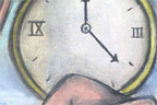
Tick Tock
I came across this idea while watching a commercial for a skin moisturizer product. The commercial showed a person’s skin cracking and deteriorating. I thought it was a really cool idea so I decided to use that same kind of imagery but for a different concept.
I never finished this drawing completely. I was gonna do more with the clock and I had originally planned to draw broken pieces of skin floating across the sky. Unfortunately, I never got around to it. Also, the scanner totally left a line along the right center :-(
Medium:
Size:
Date:
Chalk pastel
13" x 18"
Jun. 2006
St. Francis in Ecstacy
This was done in sophomore year, the assignment was to recreate a piece by an old master. I chose to recreate Saint Francis in Ecstasy by Francisco de Zurbaran.
Medium:
Size:
Date:
Charcoal
18" x 24"
Dec. 2005
LOADING...